Wimbledon's Purple and Green: Identity Written in Chlorophyll and Royalty
The Championships' iconic palette weaves together Victorian weed-killing pragmatism, imperial pageantry, and brand alchemy.
A Chromatic Inheritance
Before the first ball is tossed at Centre Court, before the umpire leans into the microphone with that unmistakable Wimbledon cadence, a colour has already spoken. It arrives not as paint but as atmosphere. Purple and green, intertwined like ivy on a brick wall, are the visual DNA of the oldest tennis tournament on earth.
Every Grand Slam has its chromatic signature. Roland Garros burns clay-red. The Australian Open throbs with cobalt blue. Flushing Meadows throws the full neon circus at your retinas. Wimbledon, true to its character, whispers. Its palette is not chosen for attention but for resonance. These colours are descended from Victorian sensibility, not marketing departments. They carry the weight of 146 years of unbroken tradition, refined rather than redesigned.
Chlorophyll as Canvas
Begin with the green because Wimbledon's green is the colour of purpose. The All England Lawn Tennis and Croquet Club grounded its identity in the very surface on which the sport was played. Grass. Not the decorative lawn of a suburban garden but the cultivated, sweating, living turf of competitive tennis.
In the late nineteenth century, when the club formalised its identity, green was not merely aesthetic. It was territorial. The club badge, the signage, the ribbons on the trophies, the very awnings that shaded royalty, all drew from the chlorophyll that made the game possible here. The grass was not a stage. It was a co-author of the sport's British soul.
This green carries a dual nature. It is vibrant in the tournament's first week, almost luminous under the June sun, then gradually yellows and browns as the fortnight grinds on. By the second Sunday, the baseline is a map of wounded earth, every eroded patch a testament to the battles waged there. Green at Wimbledon is a colour in motion, fading as legends are forged.
The Purple Parenthesis
If green is the body of Wimbledon, purple is its crown. The inclusion of purple into the club's official palette was not arbitrary. It carried a cultural weight that modern sensibilities can easily miss.
Purple has been the colour of imperial and royal authority since antiquity. Tyrian purple, extracted from sea snails on the Mediterranean coast, was so ruinously expensive that only emperors could afford it. That association calcified over centuries. By the time Queen Victoria sat on the throne and the All England Club was founded in 1868, purple was shorthand for sovereignty, ecclesiastical authority, and the unbridgeable gulf between the common and the crowned.
Wimbledon's adoption of purple was a quiet declaration of patronage. The tournament operated under royal warrant, its grounds visited by monarchs, its trophies presented by dukes and duchesses. To wrap the Championships in green and purple was to announce that this was not merely a sporting event. It was a royal occasion played on living turf.
Purple is not a colour you stumble into. It is a colour you inherit.
Evolution of a Brand
The late twentieth century forced a reckoning. Wimbledon may be tradition-bound, but it is not immune to the forces of commercial gravity. As the Open Era dawned in 1968 and professionalism flooded the sport, tournaments began to understand that their visual identity was not decorative but commercial. A colour scheme was a brand. A brand was revenue.
The purple and green were crystallised, codified, and protected. Specific Pantone shades were locked in. The dark green of the courts, the mauve-purple of the club crest, the specific blend used on scoreboards and banners. All were fixed into a design system more rigid than most corporate identities.
The championships insisted on consistency. From the towels draped over players' chairs to the umbrellas Held by ball persons during rain delays, the palette remains unwavering. In an era of sports branding where leagues refresh their logos every five years, Wimbledon's refusal to modernise its core visuals is not stagnation but conviction.
The Eye of the Designer
What makes this palette so enduringly effective is its chromatic tension. Purple and green sit near opposite ends of the colour wheel, separated by roughly 180 degrees. They are complementary in the technical sense the Impressionists understood. They vibrate against each other, producing a visual energy.
Plant purple against green and the green appears sharper, cooler, more alive. Place green beside purple and the purple deepens, acquiring a velvet richness it lacks in isolation. This is not accidental. Whoever first paired these colours for the All England Club possessed either extraordinary instinct or extraordinary fortune.
The scheme also functions across scales. On television, where most of the tournament's one billion annual viewers consume it, the colours read with clarity. Purple signage pops against the green field. The white of the players' kit, mandated by the tournament's famously strict dress code, slices through both as a third structural colour. The result is a visual architecture that needs no logo to be instantly recognisable.
A Palette That Refuses Fashion
Other sports have rebranded themselves into forgettability. Tennis itself has seen tournaments cycle through visual identities with the restlessness of a reality show contestant. Wimbledon's restraint feels almost defiant.
The colour scheme has remained untouched for over a century. It does not chase the Zeitgeist. It does not consult trend forecasting agencies. It simply exists, rooted in the same soil that sustains the grass and the same cultural memory that sustains the institution.
The Language of Spectacle
Consider what a Wimbledon morning looks like to the fan walking through the gates at Gate 1. The purple of the hanging baskets, the surge of green from the courts visible through gaps in the stands, the dark navy of the volunteer blazers moving between them. This palette greets them like a chord progression, resolving before they have conscious awareness of it.
The experience extends to every surface. The signature purple and green towels. The thread count runs higher than most hotel linens. They are souvenirs of belonging, wrapped in the tournament's colours, carried home to bathrooms from Tokyo to Toronto. The umbrellas that shield dignitaries from the inevitable English rain. The tags on the merchandise bags. The ribbons on the Championship trophies themselves, where purple and green silk thread circles the silver gilt of the Venus Rosewater Dish and the Gentlemen's Singles Trophy.
Every detail reinforces the same palette. The cumulative effect is a sense of total design, rare in a world of fragmented brand experiences. Wimbledon's colour scheme is not applied to surfaces. It emanates from them.
The Grass Beneath the Pigment
There is a final layer to this chromatic saga, one that brings the story back to the earth from which it grew. Wimbledon's green is not permanent. It is renewed annually, seeded and swept and coaxed into existence by a ground staff of 20 full-time specialists who begin preparing the courts before the previous tournament's final point has been replayed on YouTube.
The grass is a perennial ryegrass blend, chosen for its durability and its deep colour. It is cut to exactly 8 millimetres and rolled daily during the Championships. The green you see on your screen is the product of agronomic science and artisanal care that has been refined over a century and a half.
The purple, too, has its hidden history. The specific shade the club uses is not the Tyrian purple of emperors, which carried a reddish-bronze cast. It is closer to the mauve discovered accidentally by William Henry Perkin in 1856, the world's first synthetic dye, which democratised purple and made it available beyond the treasuries of monarchs.
So Wimbledon's palette is a paradox. A green forged by modern horticultural science and a purple born of Victorian industrial chemistry, wrapped together to evoke an institution older than both. The colours make us forget their own modernity.
This pair of colours is a rare example of authenticity in sports branding. They were not chosen by committee to maximise market penetration. They emerged from a club rooted in the soil of south London, conscious of its royal patrons and protective of its identity.
In an age where sport is becoming increasingly homogenised, where every arena looks like every other arena and every broadcast package borrows from the same visual grammar, the purple and green of Wimbledon are a quiet rebellion. A reminder that identity can be inherited rather than invented. That a colour can carry eight generations of meaning. And that some things, when they are right, do not need to be redesigned.
The tournament's true brilliance is not that it refuses to change. It changes constantly, in its surfaces, its technologies, its global reach. Its genius is that every evolution passes through the filter of those two colours, emerging not as contradiction but as continuity. Wimbledon does not live in the past. It simply ensures the past remains visible in everything it does through the purple and the green.
Editorial Integrity
This is an original SportPulse article written by our editorial team. All content is independently researched, written, and reviewed by our writers and editors before publication. We do not publish copied, aggregated, or syndicated content.
SportPulse is committed to original sports journalism. Read our editorial policy or contact us with any questions.
More Like This
All tennis
Anisimova Eyes Wimbledon Redemption After Swift Emotional Recovery
Amanda Anisimova lost last year's Wimbledon final but recovered in six weeks — now she's plotting a triumphant return to grass.

The Fearlessness of Youth: Jodar's Five-Set Statement at Wimbledon
Rafael Jodar, 19, erased a two-sets-to-one deficit to stun Carrenño Busta in a match that refused to end on day one.
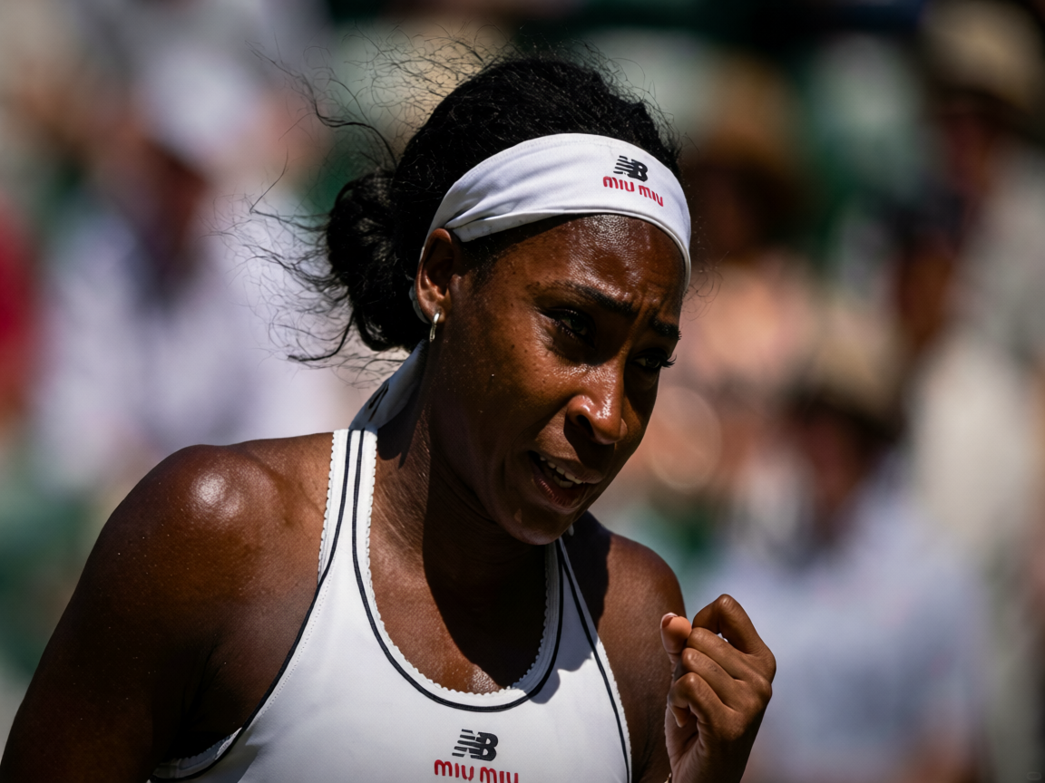
Gauff Edges Pegula in Thrilling Comeback to Reach First Wimbledon Semis
Coco Gauff overcomes Jessica Pegula in a gritty five-set battle to reach her maiden Wimbledon semi-final.